Truth: honesty and integrity, unwavering in fact and reason.
Motto
-
Education
Truth EducationCultivating firefighters with strong field and disaster response skills through knowledge, hands-on training, and character development. -
Personality
TRUE PersonalityPersonality encompasses one’s dignity, role in the community, and intellectual, emotional, and volitional traits. It reflects the development of an individual who, through self-realization, values both the public and themselves. -
Service
TRUE ServiceStriving wholeheartedly for the nation, society, and others without regard for oneself, embodying 119 firefighting spirit of dedication and public service.
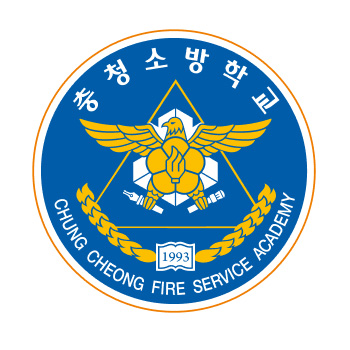
The overall design adopts a circular shape, symbolizing deep affection and selfless dedication.
It represents the ultimate mission of firefighting — to protect the safety of the people of the Republic of Korea with endless love and devotion.


The central shape incorporates the image of a phoenix and a national flower, symbolizing fire service, rising from within and illuminating the darkness. The pen symbolizes wisdom and disaster safety education, capturing the identity and educational values of the Chungcheong Fire Academy.
As a fire service education institution, the emblem features a flame in the shape of a circle to represent the academy’s spirit of challenge and passion, and includes the founding year “1993” of Chungcheong Fire Academy.
The blue color in the background symbolizes life, safety, and trust, while also representing the high aspirations and youthful dynamism of the academy, implying a strong leap forward (Bi-Sang, 飛上).
The warm orange tone of the modern circular frame symbolizes inclusiveness, comfort, youth, courage, and energy, encompassing the essence of fire education and the academy’s commitment to the safety of the people.
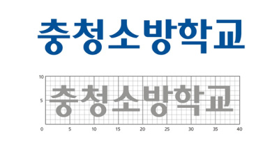
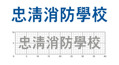
The logotype, along with the symbol mark, is a key element in conveying the visual identity of the Chungcheong Fire Academy.
It has been designed with a modern aesthetic, considering consistency and harmony with the symbol mark, and therefore must not be altered arbitrarily.


To prevent distortion when using the logotype, only the reproduction materials provided in this manual or the original files included on the CD-ROM should be used, either by enlarging or reducing them.
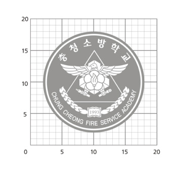
In cases where large-scale output or computer printing is not possible, the logotype must be precisely constructed in accordance with the grid system specified in this section.

